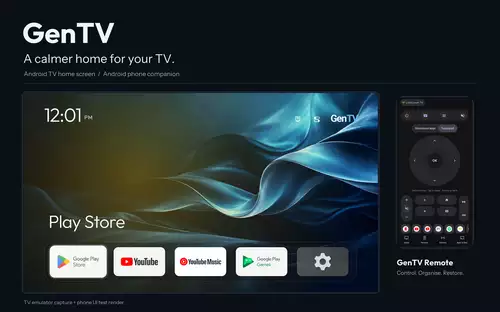
TV软件 GenTV 开源TV桌面,用手机就能装、能清理、能遥控 之前分享迷给大家分享过不少电视桌面美化、去广告和系统精简项目,比如 CleanYourTV、AerialTV 等。这些项目各有特色,但有一个问题:部分方案需要借助电脑、ADB 命令,或者让 AI 帮忙... 分享迷 2026-11-07 1
电脑软件 宗谱管理系统 v8.0 单机不联网 大家都翻过自己的族谱吗?一般来说,要是家族里出了个厉害角色,像古代中了进士、做了大官,或者现代有了重大科研成果、获得国家表彰,那都是光宗耀祖的大事,必定会被记入族谱,成为后世子孙敬仰的榜样。以前的族谱... 分享迷 2026-11-07 0
TV软件 PoHW(答题守护) v1.0.2 中小学电视防沉迷 答对题目才能继续观看 它的核心逻辑非常简单:想看电视?可以,先完成一道题。答对了,获得30分钟观看时间。时间到了,再做一道题续期。这和前面新闻中那位父亲的思路简直不谋而合。PoHW安装并开启之后,会在后台运行一个常驻服务。... 分享迷 2026-11-06 1
手机软件 GKD v1.13.0正式版 跳开屏广告 这个开屏跳过APP很强大,它和李跳跳这类APP不一样,他是基于应用跳过规则订阅的方式实现跳开屏的,你可以理解为跳过开屏界的“TVb0x”。每个APP的开屏广告可能不一样,对应的跳过规则也不一样,于是有... 分享迷 2026-11-06 40
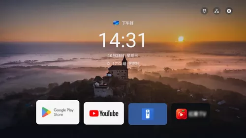
TV软件 quiet-tv 一个简洁、可自定义的电视桌面 一个明确面向国内电视机的适配与升级改造项目,基于CleanYourTV开发。它在保留轻量、无广告特性的基础上,增加了壁纸每日更新、天气、儿童模式、应用分类管理等本地化功能,并提供了更细致的机型验证和可... 分享迷 2026-11-06 0
TV软件 Tigris 最接近AppleTV,支视频桌面 这是一个这批项目里视觉上最接近tvOS 26的,比如毛玻璃控制中心、风景照片背景和相框屏保等。而我觉得它最有意思的是桌面能直接放哔哩哔哩热门。而且壁纸有必应每日、Wallhaven 二次元、Apple... 分享迷 2026-11-06 1
TV软件 Aerial 给国产电视的一块干净桌面 支持安卓4.0 参照 Apple TV 做的 Android TV 桌面:没有广告,没有推荐流,只有你的 App、壁纸和航拍屏保。适合小米、TCL、创维、索尼等国产电视,也能装在盒子和投影仪上。开机自动进入,待机也不... 分享迷 2026-11-05 9
TV软件 myDV v2.3.43 抖音第三方电视版 刷抖音已经成为很多人日常的娱乐方式,但手机屏幕太小,窝在沙发上用电视大屏来看才是最爽。于是分享迷给大家带来一款利用AI开发的,专为电视打造的抖音第三方客户端。由AI深度优化,完美适配电视遥控器,不用繁... 分享迷 2026-11-05 50
TV软件 XT v0.2.14 小红书TV版 不知道兄弟们平时有没有刷小红薯的习惯?你有没有想过,躺在沙发上,用遥控器在电视上刷小红薯是一种什么体验?当大多数人还在手机上滑动拇指翻看笔记时,一个名为 XT(xhsTV) 的开源项目,悄悄把小红薯的... 分享迷 2026-11-05 6
手机软件 橘汁视频手机版 v3.0.7.0 纯净版 橘汁视频的手机版,之前分享过TV版《橘汁视频TV版》。橘汁视频已支持 Android 端、TV 客户端,iOS 版本也即将发布。这意味着无论你使用的是手机、平板还是智能电视,都能安装橘汁视频,随时随地... 分享迷 2026-11-04 10
WinPE 微PE工具箱 v2.3 20261102增强版 最纯净好用的pe 有过装电脑系统经验的朋友肯定对电脑店、老毛桃、大白菜等pe工具不陌生,不过这些pe大部分都夹带私货;今天要推荐一款口碑特别好,无任何广告推广,内核完整精简,采用全新Win10PE内核,堪称最好用的全能... 分享迷 2026-11-04 30
电脑软件 CrystalDiskInfo v9.9.4 开源硬盘检测工具 单文件版 之前跟大家提到过,微软发布的 Windows 11 24H2 更新补丁 KB5063878 被曝出可能引发硬盘故障,不少用户在安装该更新并进行大文件操作时,遭遇硬盘“掉盘”、数据损坏甚至存储设备永久性... 分享迷 2026-11-04 0
手机软件 PiliPlus v2.2.0.2 支持横屏 很多β站第三方版凭借极简设计、无广告体验和高度自定义功能被大批β站粉丝喜爱,这类型软件也有很多,比如biliyou、pilipala、bilimiao等。最近分享迷又发现了一款很不错的第三方版,无论是... 分享迷 2026-11-04 39
TV软件 NativeWasmTv(网页电视) v1.8.2 开源直播 支持Android 4.1 网页电视是一款横屏 Android TV 播放器,支持 CCTV-1 至 CCTV-17 以及 CCTV-5+,共 18 个 CCTV HLS 频道。最低支持 Android 4.1(minSdk 1... 分享迷 2026-11-04 29
电脑软件 AB Download Manager v1.11.4 开源免费下载工具 下载文件是我们日常工作和生活中经常进行的操作。面对动辄数十GB的4K影片、设计素材包或开发工具,传统浏览器的单线程下载如同"涓涓细流",非常影响我们的效率和体验。那么,一款高效且易... 分享迷 2026-11-03 10